

A Google search will have you know that there are at least 265,978 computer fonts. No one knows why! Do you know how many years will be gobbled up if you were to use one font a day? Some 278 years! Well, how do you make up your mind on what font to use to design a website? Difficult? Not really! Some fonts have it in them to transform a drab look into as exciting as the next Bond movie; you may not require a recognised diploma of graphic design to understand their brilliance! It is the intrepidity you possess that can make the change.
Headlines/Titles
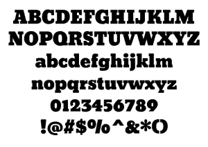
photo: mob0.com
-
Bevan
Title always says it all. And, if the font is not unique and eye-catching, all efforts at drumming up a brilliant text may go awry. Bevan readily comes to mind. It embodies boldness and carries with it the spirit of exploration that you want the visitor to catch on. This invention of 1930 has been adapted for an electronic browser in its digitized and reshaped form.
-
League Gothic
League Gothic is in a league by itself. The sharpness exudes a non-nonsense appeal that can transform a title into something authoritative.
-
 Code Light
 Code Light
The modernity that this font spells is undeniable. The way this font is used in a way that letters converge on each other can convey the message that the company a close-knitted affair and can be readily trusted. Code is the perfect font for a sleek and modern feel in web, print and graphic design.
-
Code Bold
This description itself says what it is all about. It carries the same weight as Code Light; only the impact is at double the rate! When you want an impact that one cannot fail to get subjected to, go for this font.
-

photo: freetypography.com
Oranienbaum
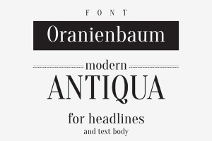
This modern version of Antigua lends an antique feel thereby radiating some level of maturity. However, it is certainly antiquated because the typefaces are modern enough with it. The right angle combinations can be clearly perceived and are impressive enough.
-
Josefin Slab
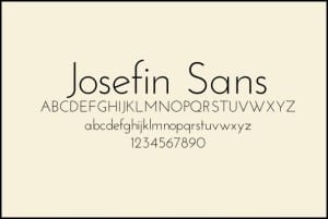
This 1903 typefaces designed by Santiago Orozco can be recognized as an organized Scandinavian style. This can be visualized as a unique style and may carry an exotic feel to it.
Paragraphs
-
Arvo
While Times New Roman is universal in its appeal, this font has a width that is uniform. You can see a contrast in the formation that gives a fillip to its on-screen readability. The flow is continuous without any obstacles.
-
Open Sans
Legibility at any size is the greatest strength of this font. It looks neutral compared to some extreme fonts but has a friendly look. A reader will be spared the struggle he might have in reading some other fonts.
-
Amaranth
Amaranth ‘s upright posture with the right amount of contrast and curves may be seen as disseminating youthfulness. And, that will work out well with the young crowd but will not exclude elders.
-
Jura
This is the font that could be called most modern with its modern personality and a feel of inclusivity of high-tech. A paragraph written in this font is pleasing to the eye and may encourage the reader to go further ahead to read more.
Author Bio:
Toni Meadows is a retired Business professor who now blogs about education and it’s importance in society. He has visited several colleges in Melbourne and has written his observations on business courses and opinions about each one.

One reply on “10 Fonts For Better Web Design”
Dynamic Support Services
Dynamic Support Services liked this on Facebook.
Comments are closed.